Web Brutalism
2025
labs
This project is a personal study to better understand what Web Brutalism is.
Role
Developer
Designer

Details
Introduction
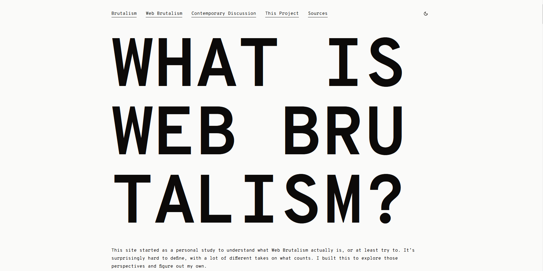
This project started as a personal study to better understand what Web Brutalism is. I’ve always been interested in design, architecture, and unconventional aesthetics, and Web Brutalism felt like the intersection of all of those. The result is a website that explores the movement’s history, its current interpretations, and the blurry lines between function, aesthetic, and intention. While not a client project, it became a unique opportunity to combine research, design thinking, and front-end development in a way that felt meaningful and expressive.
Project Overview
The main goal of the project was to document and reflect on the concept of Web Brutalism, what it is, what it isn’t, and why it exists. I wanted the website to feel like part of the discussion itself, not just a place to read about Web Brutalism, but something that could also be considered a contribution to it.
Technical Stack and Implementation
The project was built using Astro, Tailwind CSS, Shadcn UI, TypeScript, and React. I chose this stack both for comfort and exploration. React, Shadcn, and TypeScript are tools I use regularly, while Astro and Tailwind 4.0 were newer additions I wanted to experiment with. Although the subject matter leans toward raw and minimal, I intentionally used modern tools to explore how Brutalist ideas could be expressed within today's web frameworks.
Design and Development Role
I handled the design and development of the project entirely on my own. From content structure and tone to layout and styling, everything was crafted with the intention to reflect the discussion behind brutalist values—simplicity, structure, and raw presentation—while still being usable and readable by today’s standards.
I customized system fonts, stripped down UI elements, and leaned into minimal visual hierarchy. In some areas, I diverged slightly from traditional Brutalism by adding minor improvements like dark mode and spacing refinements to improve readability. One of the most interesting design experiments I considered was a minimal, modernized version of the Berkshire Hathaway website, a page often cited as a gold standard of web brutalism.
Outcomes and Reflections
This project gave me space to explore an aesthetic and philosophy I had only brushed up against before. It also challenged me to think critically about the tools I use, how they shape my work, and what it means to make something “brutalist” in a time when everything is layered in abstraction.
